Designing the Spaceship super fund
Spaceship’s first members moved their super over the phone. In February and March 2017, while we built the beta member portal, we worked through the waitlist one person at a time, helping each of them roll their savings across.
Spaceship was a superannuation fund (Australia’s compulsory retirement savings, a bit like a 401(k)) with technology companies at the core of its portfolio. The pitch was to “invest where the world is going, not where it’s been”. I joined as Head of Product and Design in late 2016, not long after a $1.6M seed round from people like Atlassian’s Mike Cannon-Brookes and Showpo’s Jane Lu.
The problem with super
Most people never choose a super fund. Their employer picks a default, 9.5% of their salary goes into it every payday and they rarely hear from it again. If they ever compare funds, it’s usually on fees.
We liked to point out that for most young Australians, super was the biggest investment they’d make that year, and they didn’t even know they were making it. That’s a strange starting point for a product. We were asking people who’d spent years not thinking about their super to care about it, and then to trust a startup with it.
Minimal viable everything
Spaceship started in stealth in April 2016, opened its waitlist that September and onboarded its first members in a beta in January 2017. Regulation and compliance slowed everything down, so the rule was to launch the smallest version of anything we could and learn from it. We called it building the minimal viable everything.
We measured everything too. Around 90% of what we tried didn’t work the way we expected. Every day at 11:45am the team got together to go through what we’d learned and feed it back into how we worked.
A waitlist without ads
The waitlist grew to 12,000 people in under 30 days, and eventually past 30,000. Little of that came from ads. It came from writing about where technology was heading, running events and reaching out to people directly.
On the product side, the job was conversion. Sign-ups were the only goal of the landing page, so we tested it constantly and measured where people dropped off. I turned what I learned into a talk at Academy Xi called Designing for growth. The short version: remove friction from forms, ask for one thing at a time and collect leads before you try to collect customers.
Nothing to copy
When I started designing the product, I went looking for inspiration in other super funds and found nothing. There were hundreds of them, and to someone in their twenties they all looked the same. Dribbble and Behance were no help either. Nobody wants to redesign super. They’d rather do the 300th concept redesign of Facebook.
So we looked at the companies changing how people thought about money more broadly, like N26, Stripe and Robinhood. None of them were super funds, but they’d made finance feel like something you could open on your phone and understand.
Designing trust
You can design a lot of things into a product, like accessibility, security and emotional triggers. A super fund exists to look after your money until you retire, so the hardest thing we had to design was trust.
For Spaceship, trust came from transparency. Super funds have historically told you very little, so the portal showed you everything. You could see the companies you owned by name and how your portfolio broke down by sector and region. Fees showed up as a line in your transactions like anything else. The main chart projected your balance against what you’d need to retire, a question most people had never been asked.
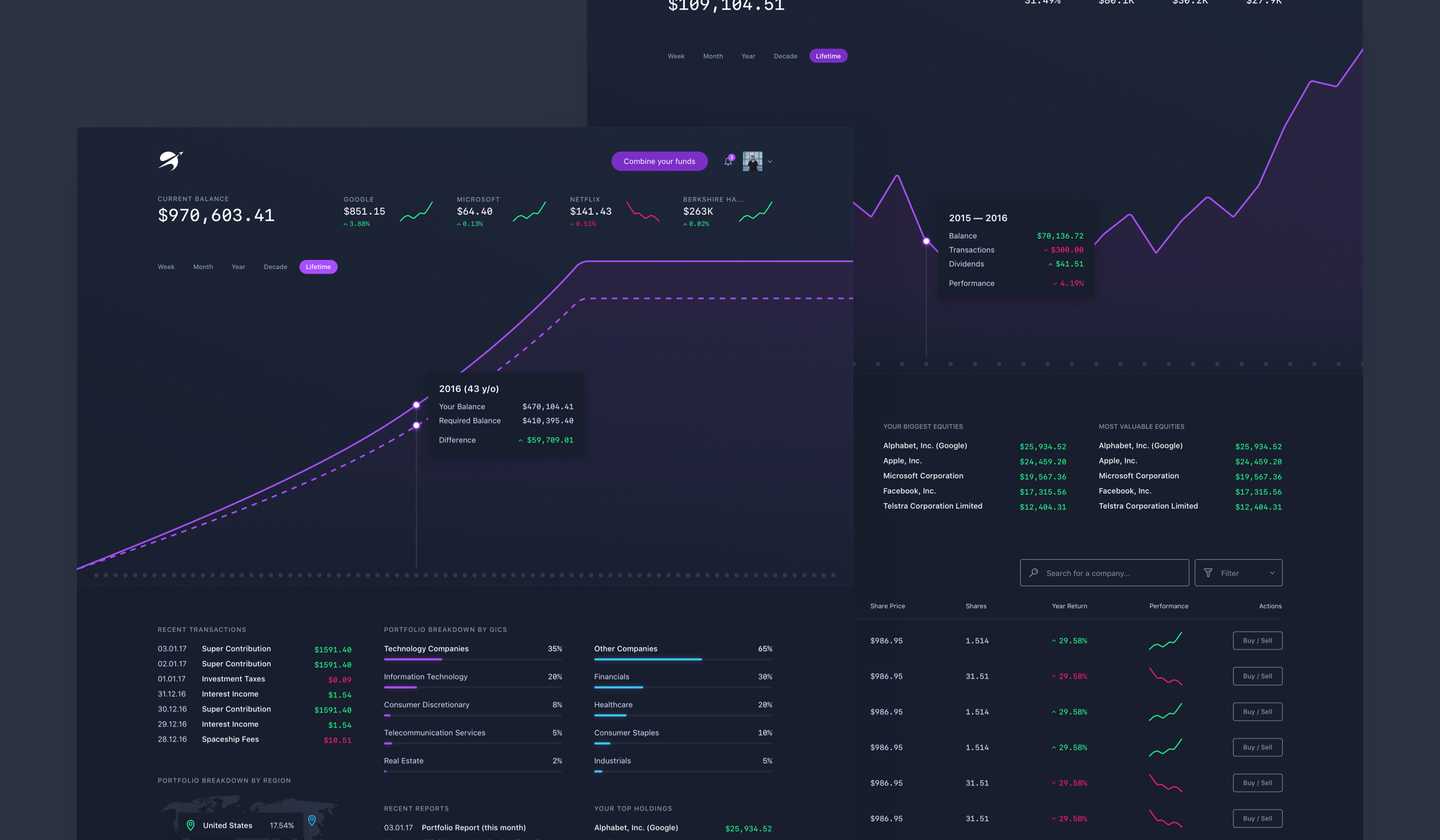
The one button in the header was “Combine your funds”, because rolling your old super into Spaceship was the first thing every member had to do. Transparency only works if it’s clear, though. Sometimes a screen had a lot to say and sometimes almost nothing, but the test was always whether someone with no interest in finance could follow it.
Simplicity over minimalism
Spaceship’s original style guide was a deliberate break from the flat, minimal look everyone else was using. It had a lot of character, and it worked well on social media and in marketing.

It didn’t translate into an interface. The first version of the member portal made that obvious: the more expressive the UI got, the harder it was to read a balance. So we kept the character in the brand and made the product plainer. Simple, not minimal. I built the foundations of Spaceship’s design system from there, and it ended up running across its platforms.
Do things that don’t scale
The phone calls weren’t a one-off. Most things at Spaceship started manually. We rolled something out to members, ran it by hand, found where it hurt and only then optimized or automated it.
Paul Graham wrote the best-known version of this idea in 2013, in an essay called Do Things that Don’t Scale. His argument is that startups don’t take off by themselves. In his words, “startups take off because the founders make them take off,” usually by doing things that would never work at a larger size.
Stripe’s founders would ask for your laptop and set you up on the spot, which Y Combinator started calling the Collison installation. Airbnb’s founders went door to door in New York, recruiting hosts and helping them improve their listings.
He also describes a more extreme version, where you don’t just use your software, you are your software. While you only have a few users, you do by hand the things you plan to automate later, then gradually automate the bottlenecks. That’s roughly how Spaceship’s early operations worked, and it’s why the daily recap mattered. Doing the work by hand showed us where the friction was before we’d built anything that might hide it.
The part of the essay that fit a super fund best is about early users. He says your first users should feel that signing up was one of the best choices they ever made. That’s a high bar for a product asking for your retirement savings, and no landing page was going to clear it on its own. A person on the phone, walking you through moving your super, had a much better chance.