Why Figma's AutoLayout system is brilliant for writing code
The AutoLayout system in Figma is a tool that helps designers to create flexible and responsive layouts for their designs. It allows designers to specify constraints for the position and size of elements within a layout, and then automatically adjusts the layout of those elements based on the constraints and the available space.
One of the key benefits of the AutoLayout system is that it allows designers to create responsive layouts that automatically adjust to the available space. This means that the same design can be used across different devices and screen sizes, without the need for designers to create separate layouts for each device. This can save a lot of time and effort, as designers only need to create a single design that will automatically adapt to different screen sizes.
Additionally, it allows designers to easily specify constraints for the position and size of elements within a layout. For example, a designer could specify that an element should be centred within the container, or that it should be positioned at the top of the container and take up a certain percentage of the available space. This makes it easy for designers to create complex and flexible layouts, without having to manually position and size each element.
However, the benefits don't stop there. The AutoLayout system is actually based on the CSS flexbox model, which is a system for laying out items in a flex container in frontend engineering. The flex container can be thought of as a box that contains other elements, and the flexbox model defines how those elements are positioned and sized within the box.
The AutoLayout system implemented in Figma is directly equivalent to the CSS flexbox model, which means that designers can use the same layout constraints in Figma as they would use in CSS. This makes it easy for designers to create designs that can be easily implemented by frontend engineers, as the layout constraints will already be specified and can be directly translated into CSS code.
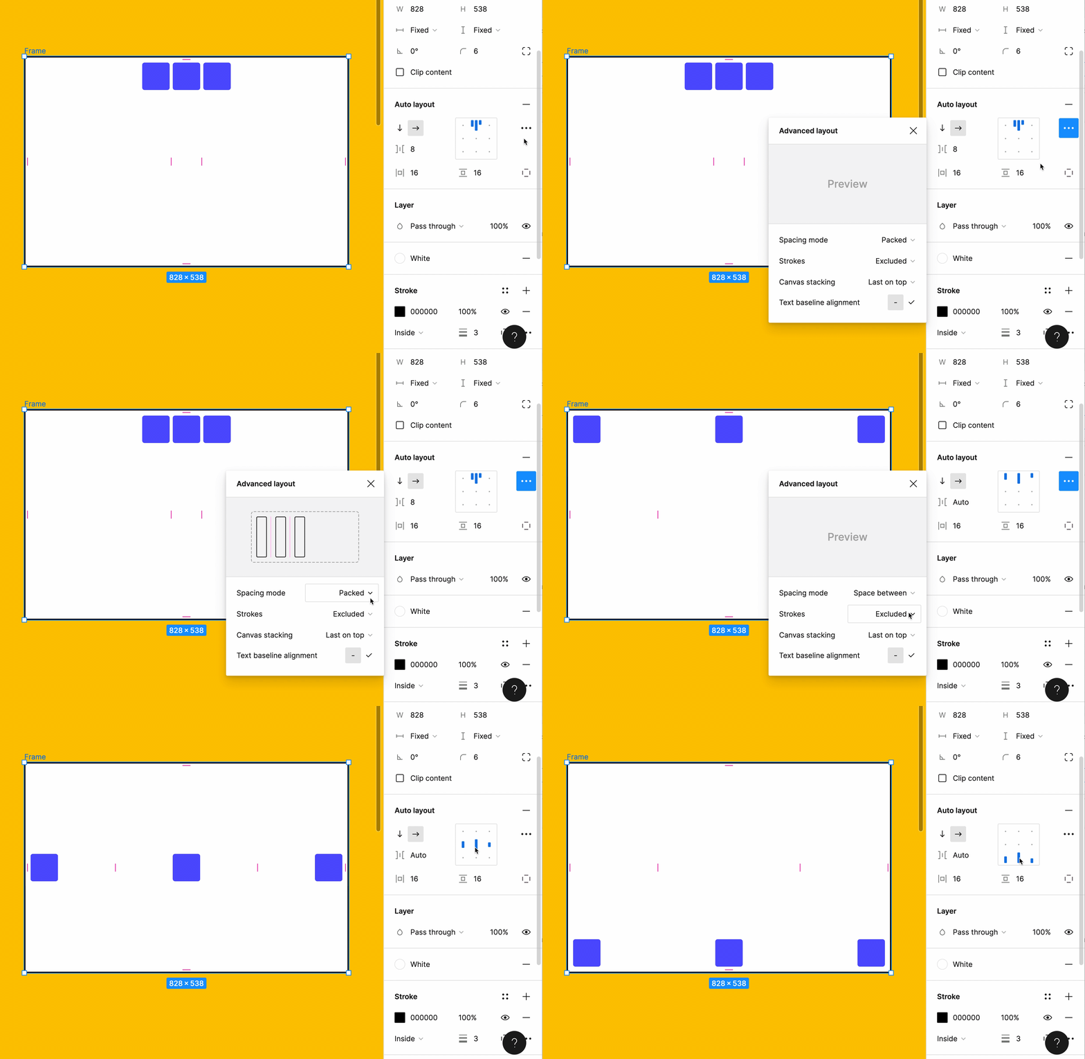
For example, this AutoLayout implementation at the end of this gif (TY Figma team):

Can be translated into the following CSS code:
.container {
  /* This enables flexbox */
  display: flex;

  /* This is the down arrow icon */
  flex-direction: row;

  /* This is the gap between the elements */
  gap: 8px;

  /* This is the vertical and horizontal padding */
  padding: 16px;

  /* This is the cross-axis alignment with "bottom" */
  align-items: flex-end;

  /* This is the main-axis alignment with "space between" */
  justify-content: space-between;
}
This becomes even easier with Tailwind as we can write it all in shorthand:
<div className="flex flex-row items-end justify-between gap-2 p-4" />This is incredibly useful for frontend engineers because it allows them to easily implement the design as specified by the designer, without having to spend time trying to figure out the exact layout and positioning of each element. This can save a lot of time and effort, and can also help to ensure that the design is implemented accurately and consistently across different devices and screen sizes.
So remember, use AutoLayout. It's brilliant.